
The bottle
Held, Not Just Seen
The bottle we wanted first, the one we chose instead, and the three questions in between.
October 2026 / JEJU GLOW Journal
In this note
The First Bottle
The first bottle we fell for looked like a sculpture.
It was unusual in the way that makes you stop and pick something up. We liked it enough to put it through compatibility testing with the oil — a few hundred dollars and two weeks of waiting.
It passed. That wasn’t the problem.
The problem was the surface. Every market we’re launching into requires a bottle to carry certain information on the bottle itself: what’s inside, how much, who is responsible for it, how to reach them. The rules differ from place to place, but none of them are optional. On that bottle, there simply wasn’t enough room to print it all.
A bottle that can’t say what it’s legally required to say can’t be sold. So we started again.
Three Questions
This time, we didn’t start with what looked beautiful. We started with three questions, in order.
Does it work — does it protect what’s inside, and is it comfortable to use at the beach?
Does it have enough surface to carry everything it’s required to say?
And once both of those are answered, is it still something you’d want to pick up?
The Hand
The obvious choice for a body oil is a round bottle. It’s what most of the category uses.
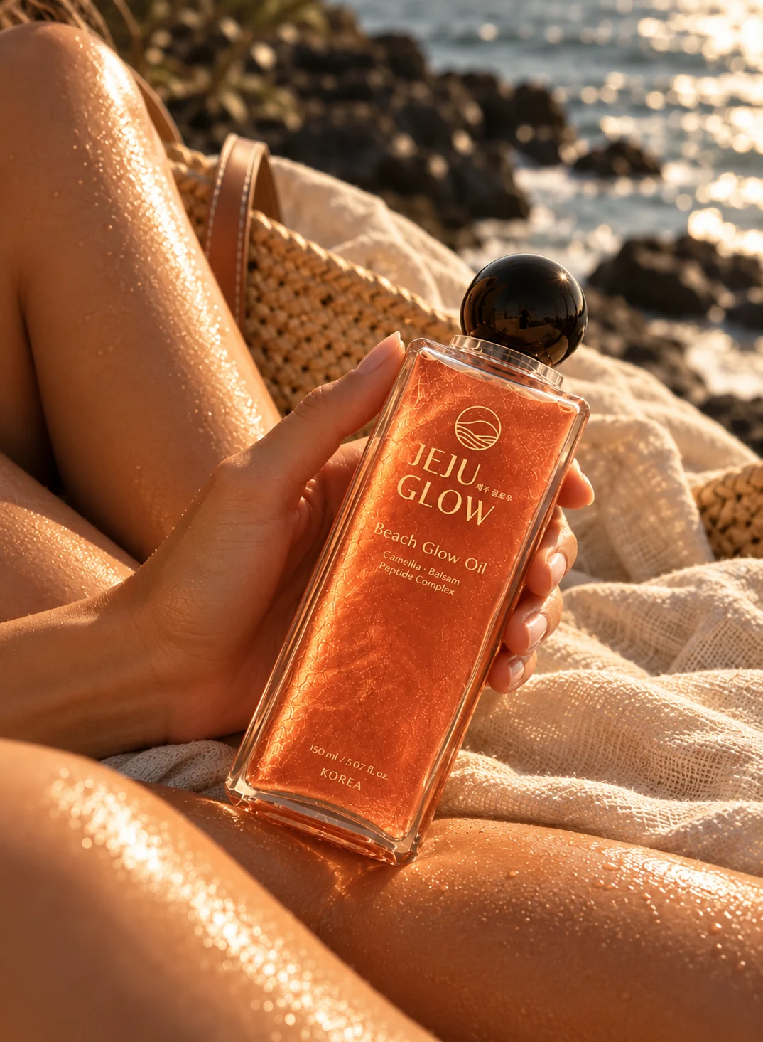
But an oil gets on your hands. That’s the point of it. And a smooth, round bottle in an oiled hand slips.
Over a day at the beach, you reach for it more than once. Each time is another chance to fumble it — and a bottle that drops open onto sand comes back up with sand around the neck.
Corners give your fingers something to hold. A square bottle stays in an oiled hand, and it stays where you set it down.
The Surface
The square solved the second question too.
The bottle we’d fallen for didn’t have enough room. A round bottle had enough room, but once every required line was printed around it, it started to look crowded.
A square bottle has flat faces. There’s room for everything it needs to carry, without the front having to carry all of it.
The printing goes directly onto the bottle rather than onto a label. Labels can lift once oil and water work under the edges. Printing on the bottle is one less thing to come loose.
The finish is translucent and matte. Matte was partly a decision about the sun. This bottle will spend its days in direct light, and a matte surface diffuses that light instead of throwing it back as glare. Keeping the oil itself stable is mostly the formula’s job — that was No. 04. The bottle’s job was not to make it harder.
Translucent lets the oil remain visible — its colour, and the shimmer suspended inside it.
The Cap
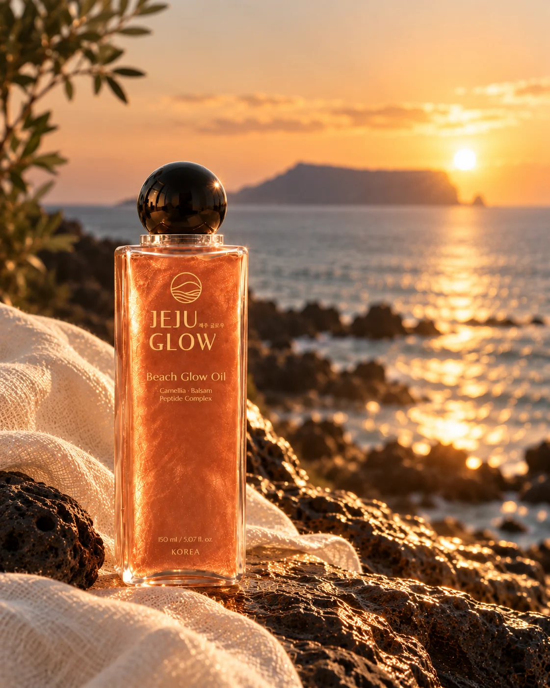
The cap is a black sphere.
We didn’t design it. We found it among our bottle supplier’s options and recognised it straight away: it looked like the dark stones along Jeju’s shoreline, the ones the sea has worn smooth and round.
Next to the square body, it does something we hadn’t planned. One shape is all edges, the other has none.
We also chose a cap that twists off rather than a pump or a spray. Shimmer particles can clog a nozzle over time, and sand finds its way into anything with moving parts. At the beach, the simplest closure is the one that keeps working.
The Third Question
We’ll be honest: we weren’t sure a square bottle suited a body oil. It felt more like something you’d find on a bathroom shelf than in a beach bag.
Then the real one arrived. With the oil inside and the black cap on, it looked better than we’d expected. We showed it to friends before telling them anything about it, and the reactions settled the question for us.
The first bottle was made to be looked at.
This one was made to be held. It turned out to be the one people wanted to look at, too.